Daktari · Case study
Making patient information easier to read and navigate.
Redesigning a dense medical platform to help doctors identify important information at a glance and explore patient history more easily.
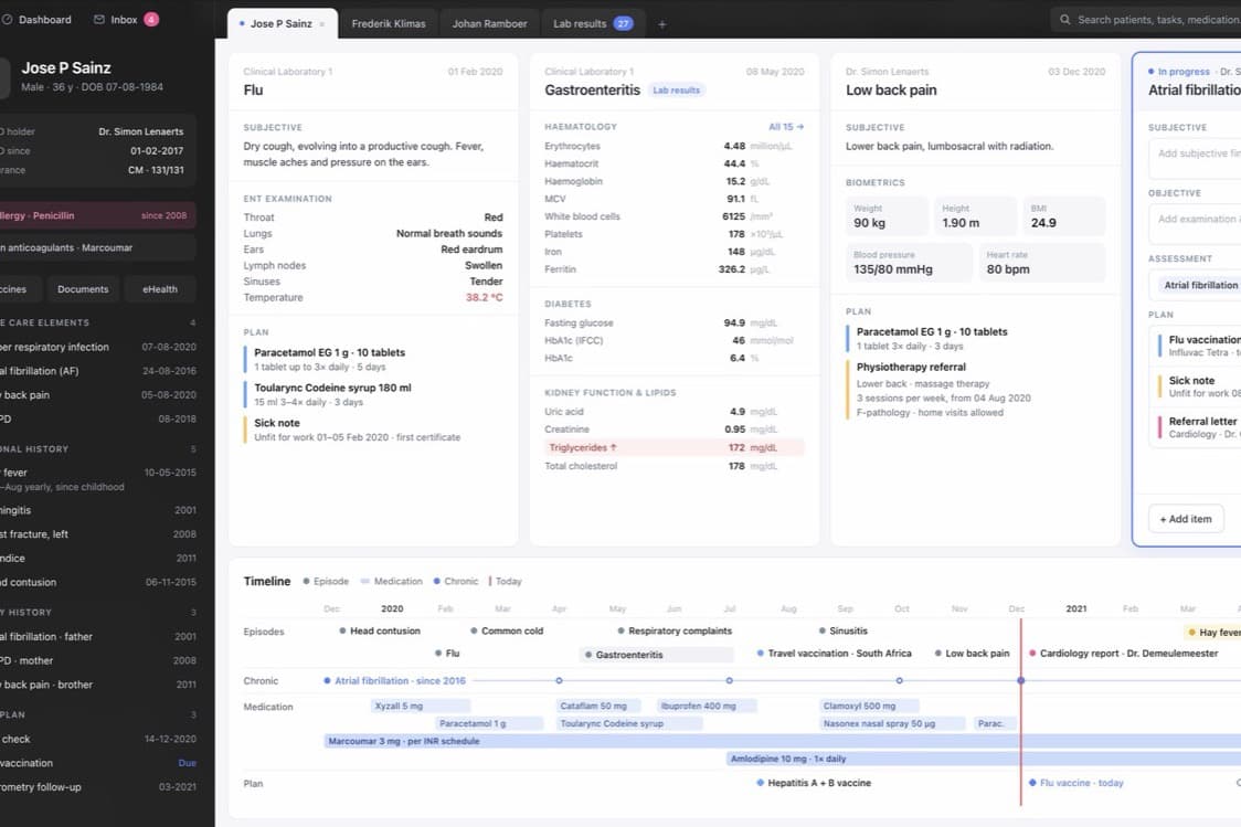
Making sense of a full record, mid-consultation.
Daktari brings a substantial amount of patient information into one platform. For doctors, the challenge was making sense of that information quickly during a consultation.
The existing interface was dense, with very small text that was difficult to read. Important details competed for attention, making it harder to scan the record and understand what needed a closer look.
My work focused on simplifying the experience through clearer typography, stronger visual hierarchy, and a more accessible way to navigate patient history.
How we got there
Starting with readability. Readability became a starting point for the redesign. Before reconsidering individual interactions, the information itself needed to be easier to read.
I introduced Twente, a font chosen for its readability, and worked on how typography could give the interface more structure. The aim was to make dense content easier to navigate while retaining the detail doctors needed.
This established a clearer visual foundation for the wider UX work.
Helping doctors see what matters. The next challenge was deciding how information should stand out.
When everything receives similar visual treatment, doctors have to do more work to distinguish important details from supporting information. I worked on the hierarchy of the interface, exploring how emphasis and grouping could help them identify relevant information at first glance.
The design needed to support two levels of attention: a quick scan to understand the record, followed by a closer reading of specific details. Making that distinction clearer became a guiding principle throughout the redesign.
Making patient history easier to explore. Patient history added another layer of complexity. Doctors needed to move through previous events while maintaining a sense of the broader record.
We introduced a clearer timeline approach to make that history easier to navigate. My work focused on how the timeline could help doctors orient themselves, move through the record, and find the information they wanted to inspect.
The timeline brought the same principles into a chronological view: readable information, a clear hierarchy, and an easier route from overview to detail.
A clearer direction for the platform.
The redesign brought together a new typographic foundation, clearer emphasis, and an improved approach to patient history.
My contribution connected visual design with practical usability: making information easier to read, helping important details stand out, and giving doctors a more understandable way to explore the record.
The central design principle was to preserve the depth of the platform while reducing the effort required to make sense of it.
Outcome
The depth of the platform, with less effort to make sense of it.