Ontoforce · Case study
Making complex scientific data easier to explore.

Ontoforce’s DISQOVER platform helps life sciences researchers connect and explore information across multiple scientific data sources, turning weeks or months of gathering data into hours. At In The Pocket, I helped make that power easier to use.
A powerful research platform that was getting in the way of its users.
Its strength was also its weakness. The platform offered powerful ways to search, filter, visualise and connect data, but the experience demanded considerable knowledge of how the system worked.
New users struggled to get started. Experienced researchers navigated cluttered dashboards and lengthy filtering flows. Expert users had learned to work around the complexity, but still encountered unnecessary friction.
The challenge wasn’t to simplify the underlying science. It was to make that complexity accessible without compromising the platform’s capabilities.
Design around what researchers need to accomplish, not around what the technology can do.
We started by understanding how different researchers interacted with DISQOVER.
Through user research, journey mapping and feature prioritisation, we identified three distinct user groups: novices looking for quick answers, experienced researchers exploring relationships in data, and expert users configuring and supporting the platform.
Their expertise differed, but the underlying problem was consistent: too much of the experience revolved around operating the tool rather than accomplishing a research goal.
This led to three guiding principles.
Reduce cognitive overload. Use familiar interaction patterns, establish a clearer hierarchy and make the most relevant information immediately accessible.
Make complexity progressive. Help users reach their first results quickly, then introduce more advanced capabilities as their understanding and needs develop. Keep extensive customisation available for experts.
Put outcomes ahead of controls. Treat search results and the actions users take with them as the centre of the experience, rather than making complex dashboards the default destination.
From navigating dashboards to finding answers.
We translated these principles into a new interaction concept organised around searching, filtering and exploring results.
The experience gave researchers a more direct path from a scientific question to relevant information.
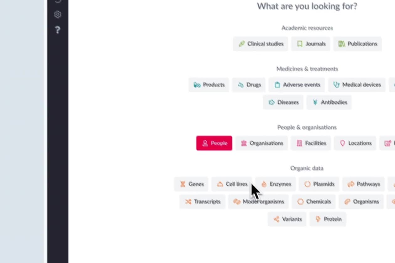
A universal search bar became the starting point. It suggested queries as researchers typed, with hit counts and result categories, so even a complex question could be asked in a single sentence.
A recognisable navigation structure established orientation, while a dedicated filtering area made it easier to refine queries without losing sight of the results.
Search history and contextual navigation supported exploration across related information, while more advanced functionality could remain available for researchers who needed it.
The design retained the depth of DISQOVER while making its everyday interactions more approachable.
Rather than redesigning isolated features, we worked through complete research scenarios to ensure the different parts of the experience formed a coherent system.
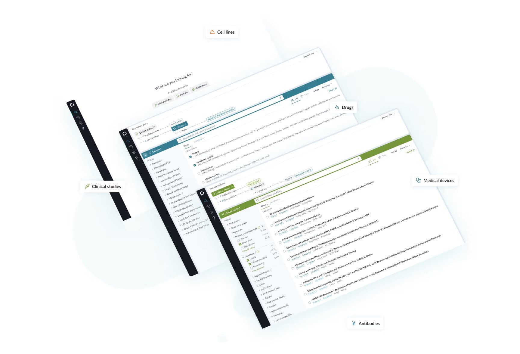
A clearer product direction grounded in real research workflows.
The work established a set of guiding principles, prioritised the platform’s most important interaction challenges and translated them into tangible design concepts.
Those concepts came together in a high-fidelity, clickable prototype, which Ontoforce has continued to build into the live platform.
It provided a shared direction for evolving DISQOVER from a feature-rich scientific tool into an experience more closely aligned with how researchers actually work.
The central design decision was simple: the complexity belongs in the underlying system, not in every interaction the user has with it.